Immigrant Youth Centre

Redesigning a non-profit website
ROLE
Visual Design, Responsive Website Design, Prototype
PROJECT TYPE
Personal Project
Redesign
Non-profit
DURATION
3 months
(Jul - Sep 2023)
TOOLS
Figma
OVERVIEW
IYC, a non-profit serving newcomer youth of Canada
The Immigrant Youth Centre (IYC) is part of Centre for Immigrant and Community Services (CICS). It is fully funded by Immigration Refugees and Citizenship Canada. Their goal is to reach out and provide a vast range of programs and services aimed at supporting newcomer youth of York Region in adjusting and settling into their new lives in Canada. Through the website redesign, I aim to make the website more user-friendly, organized and accessible.
PROBLEM STATEMENT
The current website presents several usability challenges which hinders its effectiveness and accessibility.
Design process
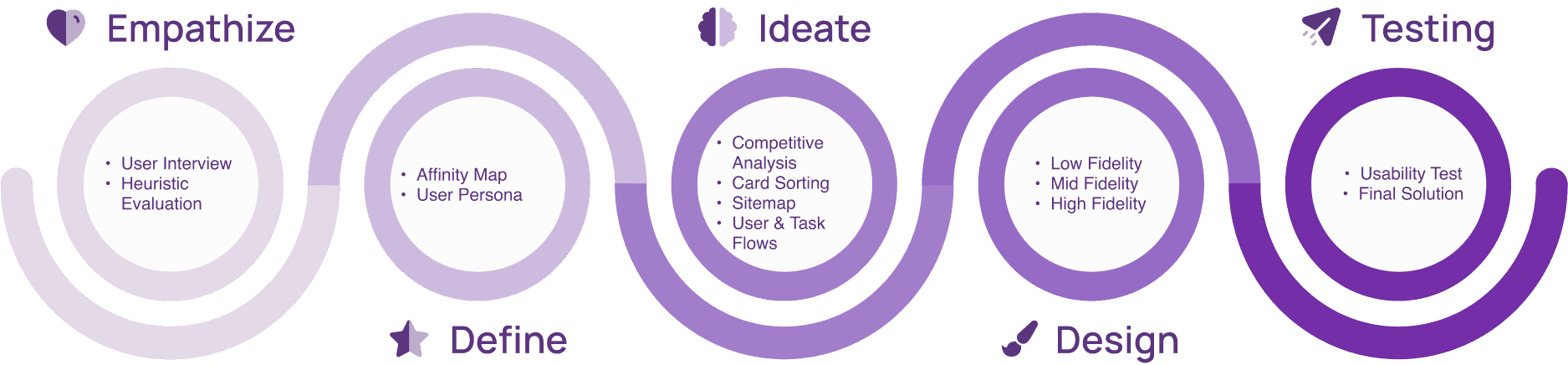
EMPATHIZE
Connecting with newcomer youth through user interviews
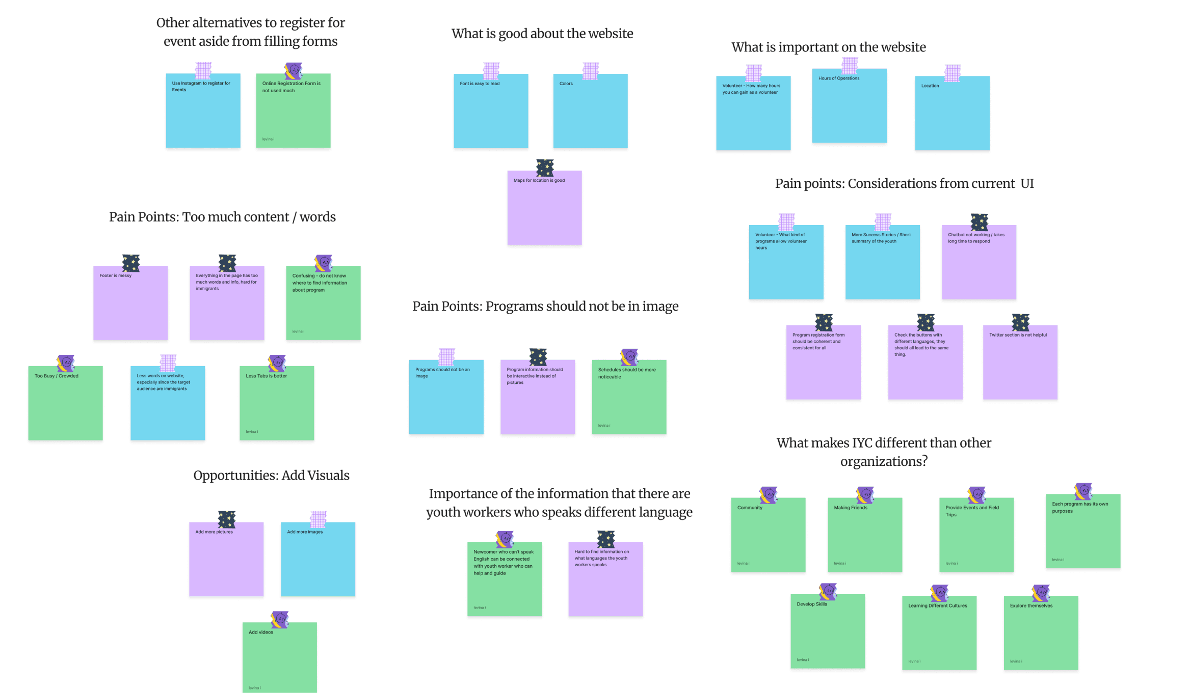
I wanted to understand how users feel about the current website. I reached out to three newcomer youth, some who are active members of the IYC community, and conducted an interview regarding how they felt about the current IYC website. Here are some of the questions and responses that was taken in the interview.
Q: What is your initial impression of the website?

“Too busy and too much going on”

“Program information has too much info, everything in the page is too much info, especially if its for immigrants.”

“It’s a lot of words in the website. It is also confusing to register for programs.”
Q: What do you think could be improved?
“Put more visuals that emphasize that they provide events, field trips, and for community, connect and make friends.”
“Program Information should not be contained in picture.”
“It’s better to have less words especially because for newcomers theres a lot of them who don’t know how to speak English.”
I analyzed the interview findings and developed an affinity map to identify recurring themes.
Understanding the usability of the website through a heuristic evaluation
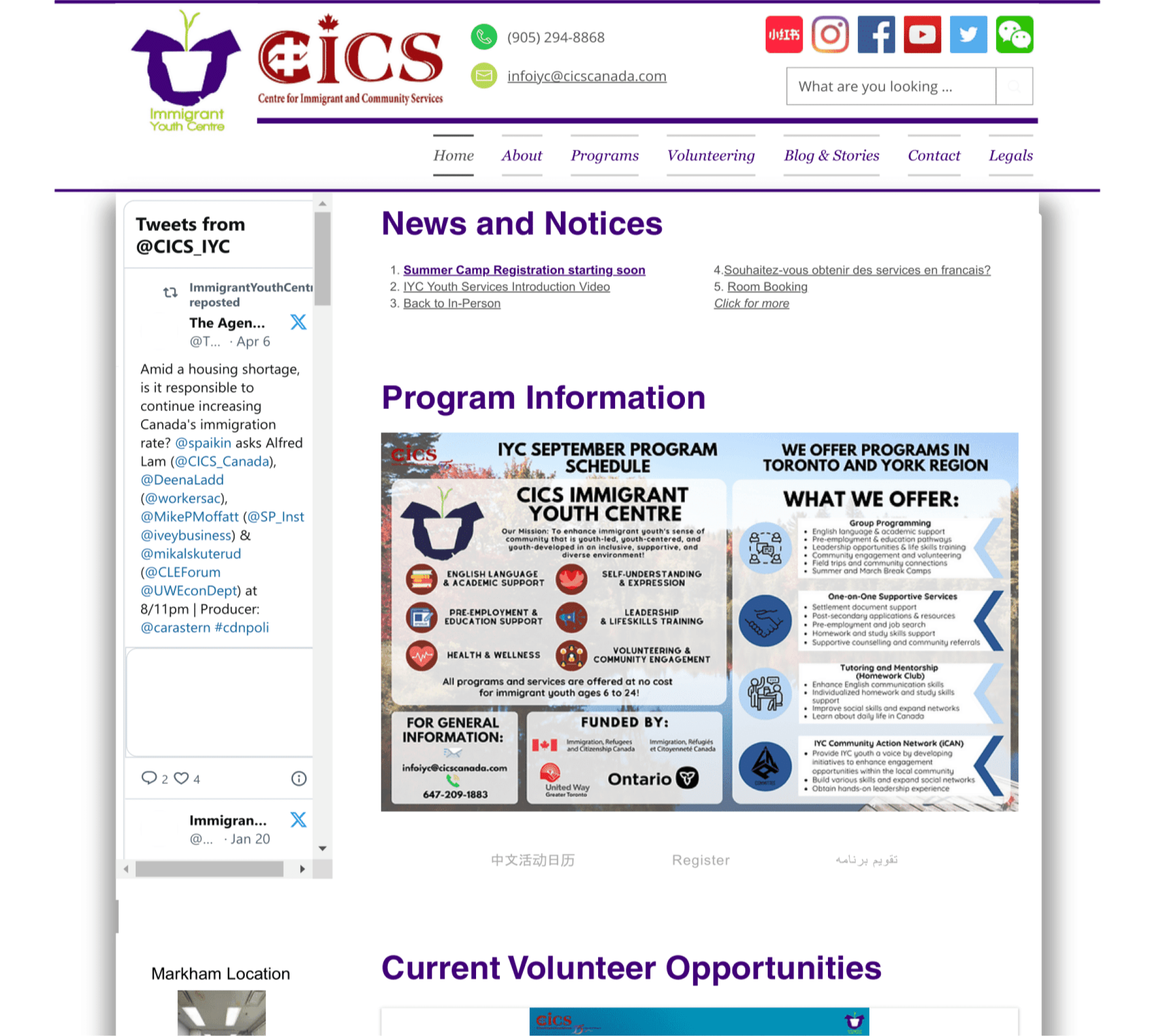
Program Information are contained within an image, which is not accessible.

Website is cluttered with information.
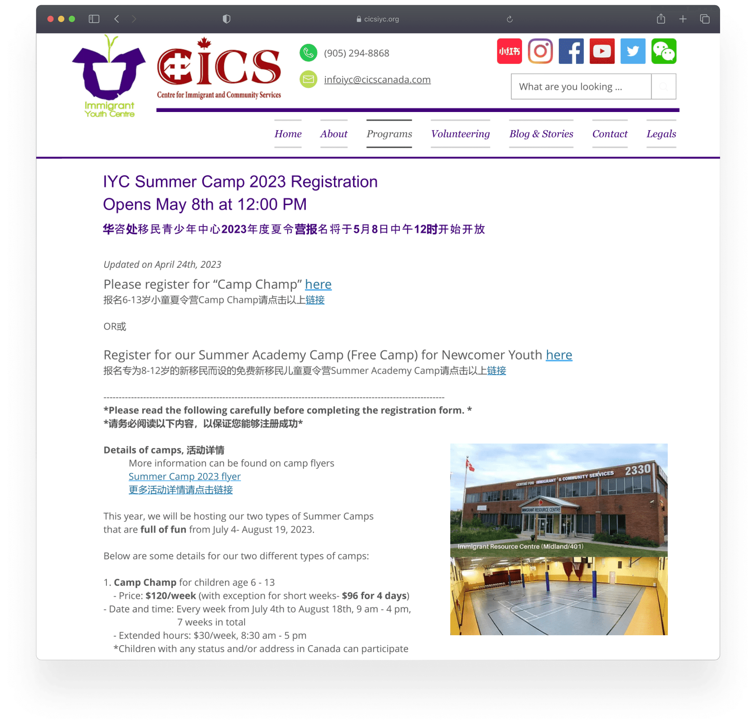
To enroll in different programs, users are required to complete distinct forms, resulting in a less-than-optimal usability experience.
Define
Creating a persona to understand user's needs
To empathize with the needs, goals, and behaviors of the target audience of this personalized makeup software, I created a user persona.

Age
24 years old
Location
Toronto
Preeti is a Indian immigrant who recently moved to Canada. She is navigating the challenges of moving to a new country. She can speak fluent Hindi and English, but still finds it challenging to express herself confidently.
Make friends
Improve communication skills
Be more confident
Pain Points
She finds it difficult to adjust to a new culture and connect with others who grew up in Canada
She struggles with being confident as she fears to miscommunicate with others due to the language barrier, therefore finds it difficult to connect with others
IDEATE
Understanding non-profits through a competitive analysis lens
I looked at other youth-serving non-profit organization in the area. This examniation allowed me to identify the strengths, weaknesses and potential areas of improvement to enhance IYC’s online presence and better serving the youth community.

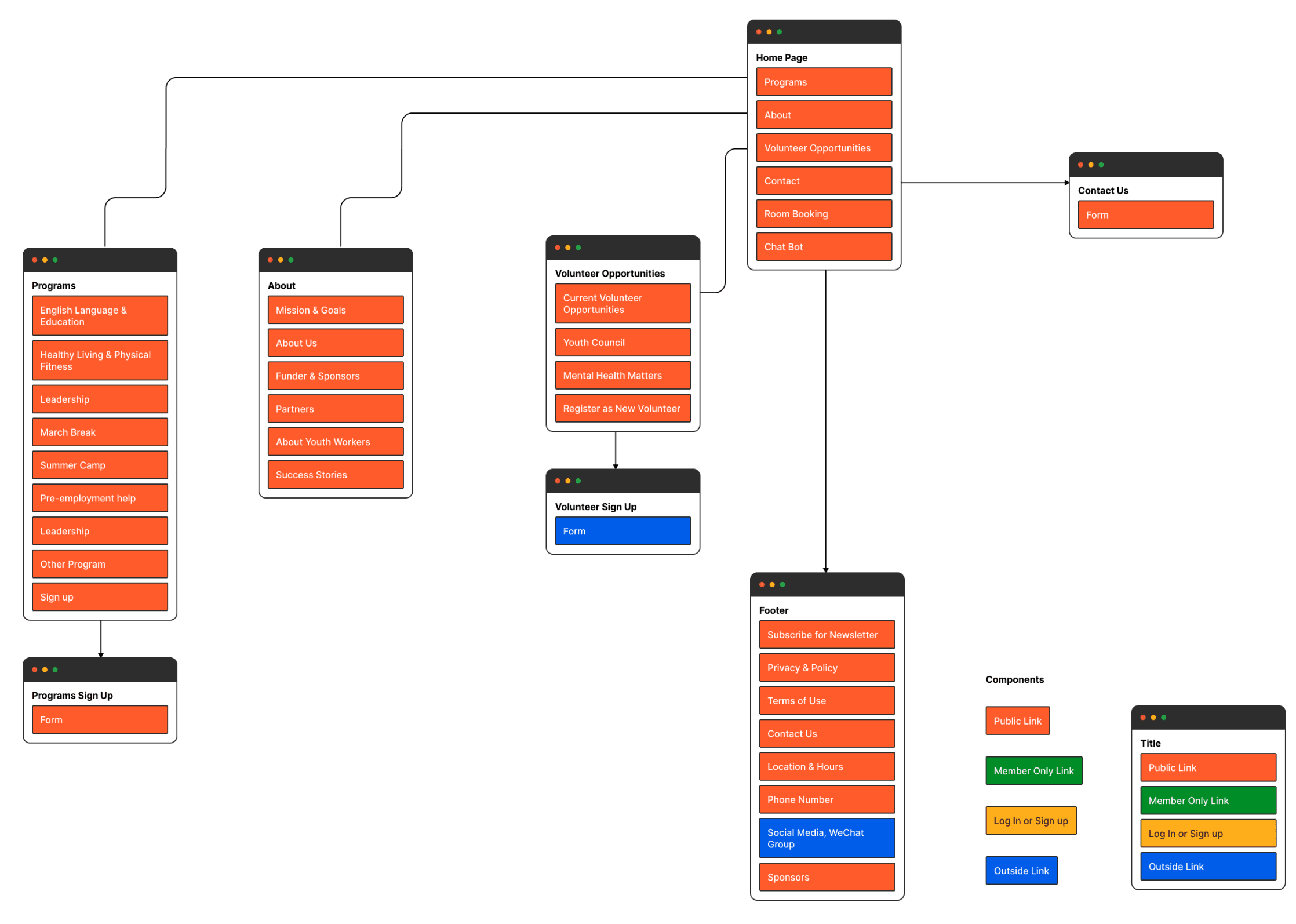
Creating a site map to organize numerous amount of web pages
To organize the way I want the website to be structured, I performed card sorting with 10 participants. Using 40 items and 5 categories, I was able to gain an insight of how the users view the categories. Through this insight, I was able to organize my website in the sitemap.
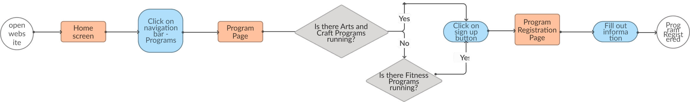
Using task flows to understand user's mental model
Here is a sample of a task flow that I created:
Signing up for a program
DESIGN
Creating low and medium wireframes using a mobile-first design approach
I started designing the low fidelity wireframes for the responsive website. Using the mobile-first design approach, I started by designing the mobile view.
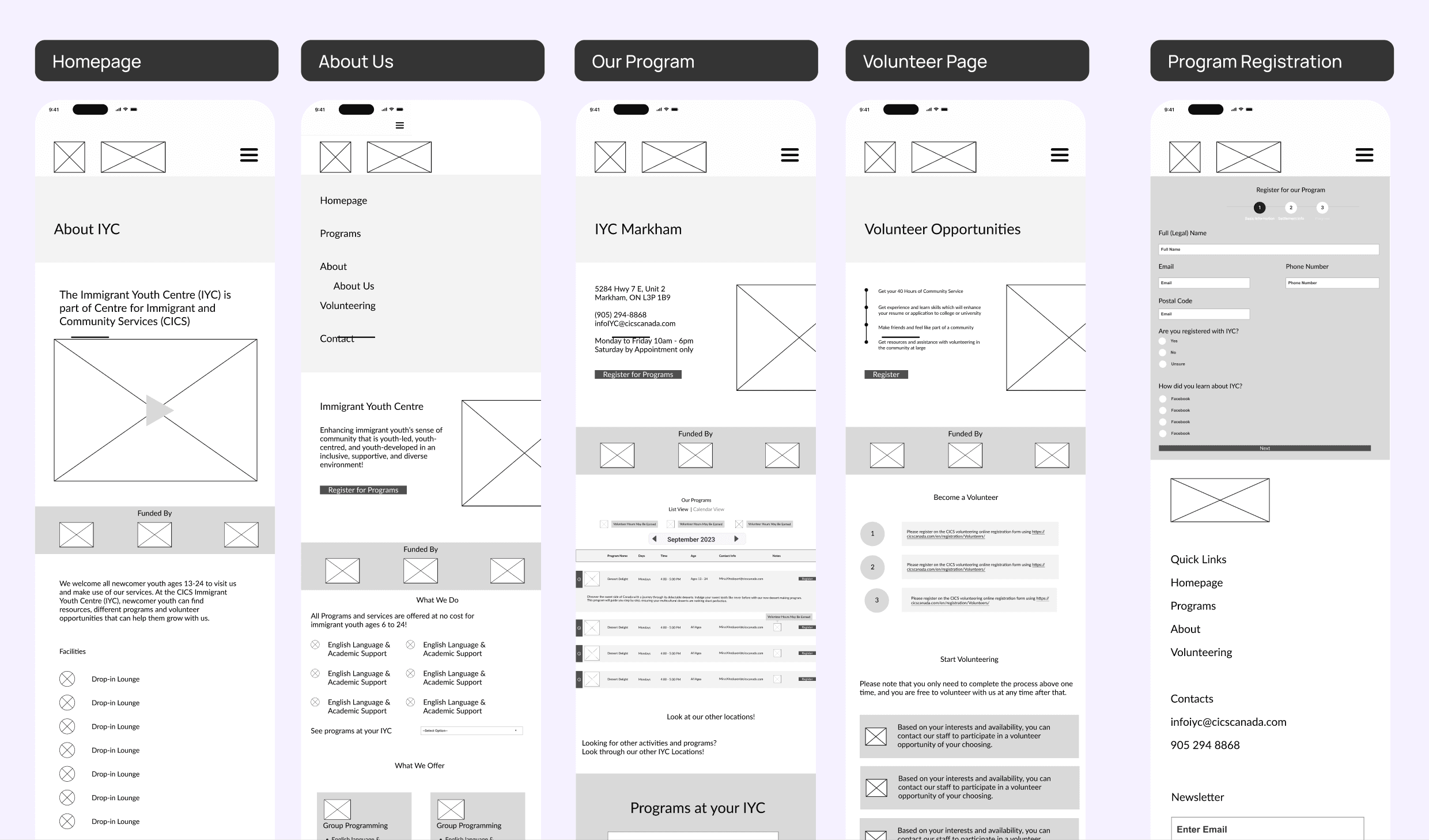
I then continued with the desktop screens. These wireframes helped me provide a foundational visual framework for the re-design.

I created a UI Kit to ensure consistency within the platform, which is still consistent with the organization’s branding guidelines

TESTING
Usability testing to ensure user satisfaction
I had 4 users perform the following task flows:
Task Flow 1: Look at a review of a business through an Instagram post
Task Flow 2: Post a review
Task Flow 3: Look at a business’ owners response to the review post
Task Flow 4: Look at a business’ review when they search the business location
Task Completion Rate
Overall User Feedback
Iteration 1: Avoid dropdown for less than 5 items
Since the organization have only three locations, it's better to list them directly to save users from unnecessary steps..

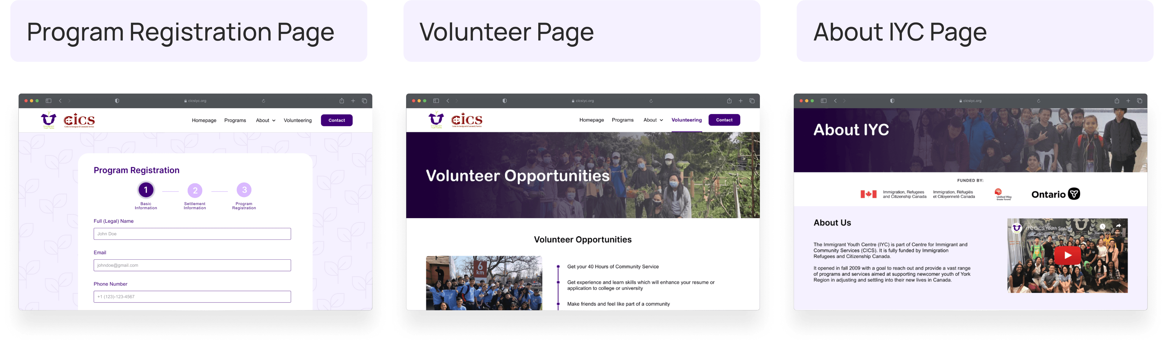
Iteration 2: Separate Program and Volunteer Registration Forms
Initially, both program and volunteer registration were in one form, which caused users confusion during testing. To address this, I split the forms for clarity and ease of use.

Iteration 3: Place <<Languages of Service>> on the Homepage
hen newcomer youth visit the website, one of their primary concerns is whether the organization supports their spoken language. In my initial design, I only listed languages on the <<About IYC Youth Workers>> page, but users often skip that section. So, I created a language section on the homepage for easy access.

FINAL DESIGN
Welcome to Immigrant Youth Centre
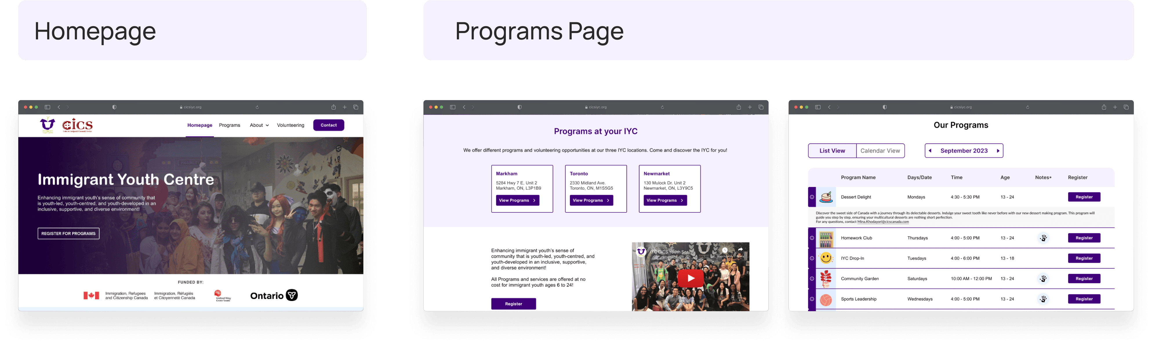

Check out the Prototype!
Reflection
Importance of User Testing
After going through usability testing, I realized the importance of user feedback. It really uncovered a lot of the design problems that the user are facing, and I wouldn’t have catch it without the user’s feedback.
Differences between Web Application and Native Applications
This project’s scope was to create a mobile-first responsive web application. At the beginning of the project, I had a big confusion differentiating between mobile web application and native application. However, as I worked through this project, I get to understand the difference between the two.
Prioritization
I also learned that I tend to get super excited over all the features I could possibly do in my solution, and get overwhelmed because I don’t have time to do all the features (especially by comparing with products that exist today). Therefore, prioritizing features is really important and helps me keep in track objectively.
Next Steps
In terms of the next steps, I will reach out to the organization and gain feedback directly from the youth worker. I'm eager to hear their thoughts and suggestions, and I'm prepared to make adjustments based on their feedback to ensure the project aligns well with the goals and aspirations of the immigrant youth in the community.