
Policy Dashboard

Designing a scalable, native policy dashboard for Sonnet Insurance
ROLE
Product Design, Conceptualization, Visual Design, Interaction Design, Wireframing
TEAM
1 Product Owner
1 Product Designer (me!)
1 Copywriter
6 Developers
1 BSA
DURATION
Sep 2025 - May 2026
TOOLS
Figma, Claude
OVERVIEW
Sonnet Insurance, Canada’s first digital insurance
I led the redesign of the Policies dashboard in the Sonnet Insurance mobile app, transforming it from a web view-based experience into a native, mobile-first dashboard.
The goal was to improve usability, reduce friction, and make it easier for users to manage their policies and access key information.
CONTEXT
Understanding Sonnet Insurance and its mobile app
Sonnet Insurance offers auto, property (tenant, condo, home), and pet insurance.
While the Sonnet app primarily supported usage-based insurance (driving tracking), the policy management experience relied on an embedded webview, leading to:
Poor navigation
Long scrolling
Disconnected user experience
Current web-based experience within the Sonnet app
CHALLENGE
👉 How might we reduce friction in policy management by creating a native dashboard that surfaces key information and actions?
Our technical and UX constraints are:
Only the main dashboard could be built natively
All deeper flows remained in the web experience
Required a seamless native-to-web transition
DISCOVER
Understanding our users
We combined journey analytics with Business Insight team and Call center team to gain a clearer understanding of user behavior.
Key findings:
After login, users most frequently:

View coverage details

Download documents

Understanding the problem
The core user goal was simple: 👉 quickly manage policies and access important documents
However, the existing experience, built within a webview-based dashboar, made this unnecessarily difficult. Users were forced to navigate long, scroll-heavy pages with unclear pathways, especially when trying to go back. Key actions were fragmented across multiple flows, and managing more than one policy became increasingly cumbersome.
Key pain points included:

Long, inefficient scrolling

Confusing and inconsistent navigation

Duplicate, fragmented user flows
DEFINE
Framing the opportunity
To address these issues, we reframed the experience around a single guiding principle: surface the most important information and actions upfront.
This shift allowed us to align both user needs and business priorities early in the process.
On the UX side, we focused on:
👀 Making key policy details easy to see at a glance
⚡ Enabling faster access to high-frequency actions
🧭 Reducing navigation friction for smoother journeys
📱 Aligning with modern mobile design patterns
From a business perspective, the redesign aimed to:
📦 Increase policy bundling (Auto + Property)
💻 Drive digital self-service while reducing support calls
DEVELOP
Exploring solutions through low-fidelity concepts
We focused on three key areas to drive the most impact: simplifying access, prioritizing information, and reducing friction across hybrid experiences.
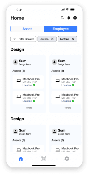
1. Centralized Dashboard as a Single Entry Point
We reimagined the dashboard as a native, centralized hub, giving users one clear place to start and act.

This reduced fragmentation and created a more predictable, cohesive experience, especially for users managing multiple policies.
2. Faster Access Through Data-Driven Shortcuts
Insights from business insights and the call center team revealed that users consistently relied on a small set of core actions. To streamline this experience, we introduced quick access shortcuts directly on the dashboard, bringing both policy-level and account-level actions into one place. This reduced the number of steps needed to complete common tasks while establishing a flexible, scalable system that can evolve with future features.

Clear Information Hierarchy for Better Decision-Making
To improve scannability, we restructured the interface using a card-based layout with clear prioritization.
By organizing content around what matters most, users can quickly understand their situation and take action without unnecessary navigation.

Supporting Improvements
To reinforce these core changes, we introduced a set of targeted enhancements:
Key pain points included:
Proactive notifications
Surfaced time-sensitive alerts (e.g., billing, renewals) at both account and policy levels
Improved navigation
Added back navigation for web flows and refined interaction patterns like bottom sheets
Business alignment
Moved offers into a dedicated space to support bundling without cluttering the core experience
Technical adaptability
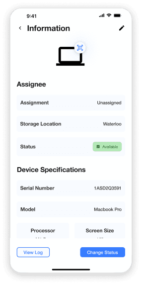
Designed native fallback screens to account for limitations in webview deep linking
DELIVER
Phased Implementation
The redesign was delivered in 4 phases, with continuous collaboration between design and engineering. Each phase was supported by thorough developer handoff and QA validation to ensure a smooth and high-quality release.
Phase 1: Core dashboard + navigation improvements
We aligned the app with a new brand direction while improving overall usability across key flows. This included simplifying vehicle management with expandable cards, standardizing bottom sheets to support accessibility, addressing navigation gaps in embedded web experiences, introducing data-driven shortcuts, and designing native fallbacks to handle web limitations.

Phase 2: Quick access shortcuts
We improved the discoverability of key actions by repurposing an existing component into an expandable floating action button that adapts on scroll, balancing visibility with a non-intrusive experience.

Phase 3: Notification banners
To improve scannability, we restructured the interface using a card-based layout with clear prioritization.
We introduced a scalable notification system across account and policy levels, focusing on clear, actionable messaging, stronger visual hierarchy to indicate urgency, and mobile-friendly button interactions.

Phase 4: Offers experience
We designed a flexible Offers experience that supports both internal and partner content, with prioritization driven by business goals and user relevance to surface the most impactful opportunities.

REFLECTION
Outcome
The redesigned dashboard is positioned to deliver meaningful impact across both user experience and business performance. It aims to drive higher engagement, improve overall customer satisfaction, and reduce drop-off across critical journeys—while also supporting increased cross-sell opportunities and bundled policy adoption.
🚀 Target launch: End of May
Key Learnings
This project highlighted the importance of designing with both constraints and collaboration in mind. Working within a hybrid native and web environment required thoughtful transitions, while early alignment with engineering helped reduce rework and ensure feasibility.
Data played a critical role in shaping decisions, allowing us to focus on real user behaviors rather than assumptions. At the same time, thinking in systems enabled us to create scalable solutions—such as shortcuts, notification banners, and offers—that can evolve over time. Ultimately, success came from balancing user needs with business goals to deliver value on both sides.
Through this project, I strengthened my ability to lead complex, cross-functional initiatives while navigating the intersection of user needs, business priorities, and technical constraints. It reinforced the importance of delivering solutions that are not only thoughtful in design, but also practical and scalable in real-world contexts.

Screenshot of dev hand-off meeting
NEXT UP